Designers, Planners & Architects
What’s the difference ?
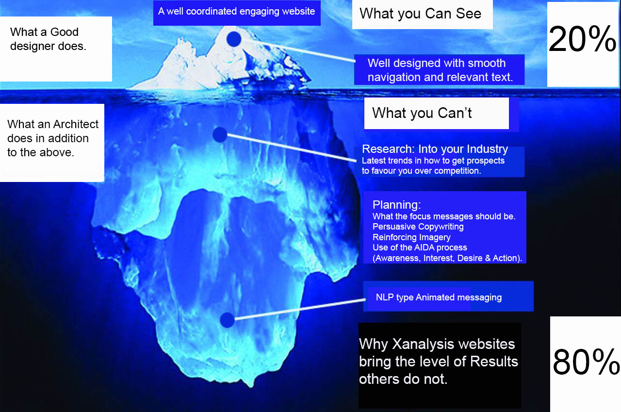
An ordinary or designed web site focuses on implementation and what looks good. An Architectural Web site does this aswell but mainly focuses on elements that affect visitor behaviour. Usually to take some sort of action following or during a web site visit, such as calling for an appointment or becoming a new customer immediately.
Both types of web site can look good but to the untrained eye, or not knowing what to look for, many wouldn’t see the difference immediately.

Conversion statistics prove the point.
A 100% difference in conversion results between an Architectural website and a well designed but ordinary one has been proven (ecommerce foundation). This is because architectural ones take into consideration competitive erosion (ie: efforts to prevent direct competitor comparisons), amongst other things, whereas DIY or ordinary designed ones do not.
In this way “cheap” becomes “expensive” if you hire the wrong person or agency.

The Architect V Ordinary Designer

2.1) Overview
As explained, an architectural website is different from any other because it is built according to the relevance, engagement and persuasiveness of the site resulting in at least double conversion rates:
- Eg: For an Accountant, ordinary designers encourage listing all the things he does, his background, experience and sometimes client referrals. The idea behind this is that visitors can then select and read that which interests them.
Looks sensible, but without focus, incorrect at the smaller business levels.
Focus on decision making stimuli, such as simplicity and value are not only more important but critical. In today’s day and age local Accountants are not only competing with other local Accountants but with anyone who is able to conduct their accounting requirements by phone or online (in all the areas that covers).
- Eg: Solicitors are seen as less homogeneous than Accountants and reasons for engagement are particular rather than ongoing, so the approach here is different. What is mostly valued are skills and experience relative to application, such as track record and experience.
The main reason for not mentioning every beneficial aspect a professional has to offer to prospects, is the detraction from the main, and most important focus message. This would be diluted amongst less important and irrelevant messages. Moreover listing everything results in being compared purely on price, as all other things appear equal, because others say all the same things.
2.2) Understanding what the client wants (and needs)
Sometimes it’s obvious. Sometimes not. But you can tell a website that does more harm than good by the amount of guessing that’s been done in terms of what the creator(s) think is important vis a vis what the facts are.
Eg: There seems to be a concensus by the number of websites that use short copy that that must be correct because people lose patience with anything protracted. That is only true in certain circumstances. If it’s used in industries with high volume competition, it’s certainly not true.
If everything you are saying is relevant, the more the visitor wants to know. It is very much target audience and requirement related.
2.3) Skeleton Outline
An Architectural website will always be constructed in stages and a map of how the website will look and why. At the mid to higher levels a plan will be constructed explaining
Web Site Decisions
Objectives
Architectural websites will always have objectives in line with what the facts about how potential customers make their decisions about whom to use (different for each industry). This is how real professional websites start. Ask any advertising expert.
There is a proclivity to assume or guess this among most web designers and often clients who do their own copywriting (thinking it’s obvious and to save time and money). This leads to web sites with impaired results
Who is it for ?
There is another tendency to think that clients are too varied to be able to group them properly into segments. This may appear to be the case but it is usually not.
As this is such an important point (all communication decisions flowing from this and the main objective) that this is top of the Agenda for discussion pre web site.
Strategies
4.1) Message
The focus (main) message is vital to get correct. This tells your prospects you are completely on the same page as they are. You understand what they want and you can deliver it.
Most web designers opt for something generic and a list of messages to ensure the “right one” is covered. However as mentioned previously this results in creating weaknesses in how the business is perceived. This is because it causes perceptions that most of what is offered is irrelevant and common.

The effect of too many messages.
You may think that a list of services has to be there because potential clients all want different things but there are ways of doing that without detracting from the main focus message.
The correct focus message is derived from data collected from large statistical samples. Not guesswork or assumptions.
Examples of main messages could be any one of Excellent track record, Creativity in problem solving, Negotiation expertise, Always winning and much more.
The way the focus message is delivered is a skill unto its own but that’s one of the things you also get with an architectural web site.
4.2) Content
Content is King.
Again what is said and how it is said across the whole site is driven by the preceding sections. You can be sure that whatever is said (driven by what makes you chosen over others) is said so you have maximum impact.

Thus maximising your position, rather than a second rate position.
Contact us now for a first rate position.
